06 April 2013

The Fruits of 'Free Markets' and Inequality: Female Mortality Rates In the US


"There is a frightening graph in a recent article in Health Affairs by David Kindig and Erika Cheng. Kindig and Cheng looked at trends in male and female mortality rates from 1992–96 to 2002–06 in 3,140 US counties.

What they found was that female mortality rates increased in 42.8% of counties (male mortality rates increased in only 3.4%). The counties are mapped below: red means that female mortality worsened.

You can see a strong regional pattern: just about every county showed had worsened female mortality in several southern states, while no county showed such decline in New England. There are many questions about what explains this pattern. For example, did healthier women migrate out of the south from 1992 to 2006?

Nevertheless, the map depicts a shocking pattern of female hardship, primarily in the southeast and midwest."

Read the rest from Bill Gardner posting at The Incidental Economist here.


And although they are certainly not the same as overall female mortality rates, here are the latest CIA World Factbook figures on maternal mortality rates (MMR) per hundred thousand. Obviously the lower the number the better.

Hey, don't complain, thank God we're not like Chad or Somalia right?   And how come all those socialist single payer countries are nearer the bottom, and they do it so much more cheaply?

Perhaps some neo-liberal hack can explain the economic principles of freedom involved to the child of a dead mother.

I know what comrade Stalin's or Herr Hitler's answer would have been about deaths and large numbers with regard to the needs of the state. Funny how the extremes tend to converge

05 April 2013

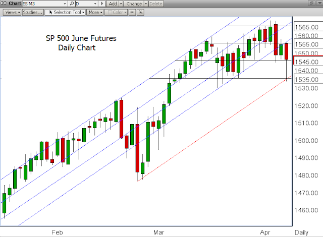
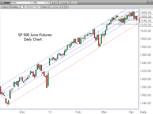
SP 500 June Futures Daily Chart - A Closer Look at Support and Resistance Levels


"This is what has been written: ‘M’ne! M’ne! T’kel ufarsin.’

And this is its meaning:
Numbered — God has numbered your reign and will end it.
Weighed — you are weighed on the scales, and found wanting.
Divided — your power will be divided and given to others.
Daniel 5:25-28

A well-tempered stock market rally/bubble.

The various support and resistance levels are apparent as well as the macro trend.

Take a look at the second chart below. If this is not a 'market operation' to inflate stock prices I don't know anything. 

At least you should have no trouble finding where we are on this road map, and when the wheels start falling off.  This is like a thrown rope.

A stock bubble financed by the Fed is a great way to transfer more wealth to the financiers. 

The US is a tale of two economies.  

Moyers:  Poverty in America Today.

Let's see how things go next week.


Very well-tempered, indeed.


Gold Daily and Silver Weekly Charts - Bounce on a Dose of Reality


"It is hard to tell where Hollywood ends and the DT's begin."

W. C. Fields

Washington and New York, like Hollywood, have become the land of illusion, excess, and make believe.

Non-Farm Payrolls was a dose of cold water on their la-la land, which they quickly shook off.  It is the tale of two economies.

Gold and silver bounced up after the incredible pounding they took from short selling hedge funds and momentum players.

I think the metal bears are one unforeseen sovereign crisis away from getting circumcised with a baseball bat, but that is just my opinion and I could be wrong.

Have a pleasant weekend.


SP 500 and NDX Futures Daily Charts - Hope Floats


The Jobs number was quite bad and a big miss from expectations.

I believe that the economy is floundering, but there is such a bifurcation between the fortunate and the rest that the financiers and politicians are not seeing it, and are in denial.

So let's see how the trend goes over the next couple of months.

It is not a surprise that the wiseguys bulled the number up into the close to cut the losses quite a bit.