Lots of interesting questions in the email bag over the weekend.
A reader asks 'What exactly is a nominal or artificial stock market rally as you use the terms?'
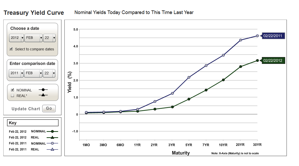
Nominal is used to mean "being such in name only; so-called; putative." This is an example of a nominal, or artificial stock market rally that someone had posted over at Alphaville earlier this year. (Hat tip to Rasputin of WSB for reminding me of where I had seen these charts.)
The Zimbabwe Industrial Index

I would have preferred a logarithmic chart for this extreme view of a hyperinflation in action, because the final moonshot tends to crush the detail of the prior action by skewing the scale so high. Still on the surface that looks pretty good right? Enough to get Jimmy C. to pound some teak on the table on Mad Money?
Another way to show the detail is to deflate the nominal chart.
The 'deflated' view is when you take the index and show what its value would be in terms of some other value, in this case the US dollar.
The Zimbabwe Industrial Index Deflated by the US$

Here is an example of the SP 500 viewed from two perspectives.

"Oh this is all very well and good Jesse, but when I go to the grocery store or to the gas station or the convenience store to buy my instant Lotto tickets I pay in dollars and not gold or euros."
Yes, but when your suppliers go to buy their goods that are imported, they pay in dollars that are depreciating. You know that some prices are moving higher despite slack demand overall. This is what we call 'selective inflation.' This is how it starts.
 The trick of course is to get off Bernanke's monetary hamster wheel. If you are not in the US, reducing exposure to the dollar is more straightforward. If you are a Yank, then generally you would look to add exposure to contra dollar hedges to lessen your currency risk. You might also wish to begin to secure some essentials for your future.
Having said all this, as you may recall we are dubious on the hyperinflationary and severe deflationary scenarios for the US. It seems that a severe 'stagflation' is most likely based on current policies. Obama and crew are inflating the currency, but it is selectively being applied to the FIRE and Health sectors, resulting in a very slack stimulus to overall employment and the median wage.
The worst of both worlds: Inflation and Unemployment.
This is the policy mistake made by Japan in trying to reflate a status quo that was broken beyond all sustainable repair. But what can you expect when you reappoint the same team of Timmy and Larry to key economic positions, the crew that started the mess in the 1990's under Robert Rubin?
Continuity of error you can believe in, it appears.