04 June 2010

US Total Government Debt Reaches 130% of GDP


Here's a postcard from off-balance-sheet country.

This includes only current debt and not future unfunded obligations.

I like to call this US debt chart "The Last Bubble," but it could equally apply to a chart showing the representation of this debt - the US bonds, notes, bills and of course dollars, which are really nothing more than Federal Reserve Notes of zero duration in the modern fiatopia.

It all adds up, eventually, and must be reconciled. It is easier to print money and accumulate debt when you own the world's reserve currency. For a while the dollar might even flourish, despite the printing, as the international savers flee ahead of the economic hitmen, from country to country, and crisis to crisis.


Chart compliments of the Contrary Investor.

Gold Daily Chart Bounces Back on a Flight to Safety


Gold often functions as a safe haven because it is a remarkably universal currency, both temporally and geographically, that is not subject to the liabilities of other parties or even national balance sheets, except potentially to the upside because of fractional reserve holdings and leveraged selling. The most significant downside to gold is the animosity that is felt by those that perceive it as a threat to the status quo, in this case the US dollar as the global reserve currency.

Silver is less constructive because it acts as both an industrial metal and a currency but with a high beta. Longer term is has significant potential, but in a crisis it will not perform as well as gold.

A reader informs us that 'investment gold' is exempt from the 15 to 20% VAT in Europe, whereas silver is not. This represents the thinking in Europe that gold is money, an alternative form of money or currency. So therefore as the Europeans seek safe havens in the event of a euro decline or devaluation, they are flocking primarily into gold and dollars, for which there is no VAT, and secondarily into other investments like silver, diamonds, etc.

The miners are a stockpicker's vehicle even in good times, but especially so in a bear market, since they are correlated to the SP 500 as well as the metal, often with significant leverage correlated to their cash flow and financing requirements.


SP Daily Chart: Looking Ugly as Baghdad Barrack Declares Economic Victory


By now you will have heard about the shocking miss on the US Payrolls Number, made even more shocking by the cheerleading that preceded it by the likes of Goldman Sachs(who were probably on the other end of that trade> and by Barack Obama himself.

The administration had nothing constructive to say this morning except for mindless sloganeering by the likes of Christina Romer, Obama's chief on the Council of Economic Advisor, who is unlikely to inspire confidence when delivering even good news, much less a clear sign of economic policy errors and a double dip in the making.

With Romer, Summers, and Geithner, the President has managed to put together the economic scream team. Even Volcker is starting to look tired and ineffective. His recent proposal of a VAT, the most regressive of taxes, sounded less like a democratic reform and more like something from the Bilderberg playbook. One has to wonder how long will it be until they start recommending the sale of key sovereign assets to corporate oligarchs.

And then there was Baghdad Barrack, talking up the economy and the jobs numbers this morning at a Maryland truck garage. He seems to be trying to run a bluff, talking his way past his team's economic policy errors and corruption, a reflexive strategy that may have served him better when he had no real responsibilities or quantifiable results.

One might feel better if the other party had not already proven itself to be the party of the elite and the wealthy special interests, without vision or ability, creating many of the problems that are sinking the US today. Things do indeed seem bleak when the reform government fails.

It appears that the SP futures may be forming a bear flag, with another big step down to follow. That would be 'bad news' because below the support at 1040 is a disturbing possibility of a triple digit SP 500.

Chart Updated at 3:30 EDT


03 June 2010

Gold Daily Chart: A Typical Fibonacci Retracement Pattern So Far


The key support levels in the pullback from the handle resistance are 1205, 1198, and 1190. These are the three key fibonacci retracement levels, although it would not be completely unusual to see a pullback to 1166. I don't think it will happen, but the market will have the final say and we must listen.

This has the look of a bear raid by the funds and banks. They were hitting the mining stocks hard first, and then the metals. The planting of negative articles and comments by funds with friendly authors was also apparent, to the point at times of silliness.

And there are plenty of investors who have missed the rally, or with a certain ideological bias, who want to see prices fall. Misery loves company. The irony is that most will never bring themselves to buy back in, because they are always looking for THE bottom, and a lower price. They will more likely buy closer in the second leg higher, when fear overcomes their greed.

This is how bull markets operate, and the reasoning behind chart formations. Charts attempt to capture typical market behaviour, and nothing more than this. They influence some trading if enough people follow them, but by and large they cannot change the primary trend. And so far this looks like a typical bull market climbing a wall of worry. Let's see if anything changes.

The 1206.80 price on the chart is as of 2:45 PM EDT.


Here is a chart comparing the Gold Bull Market compared to the famous Dow Jones Industrial Bull Market, courtesy of Mark J. Lundeen who posted it at LeMetropoleCafe.


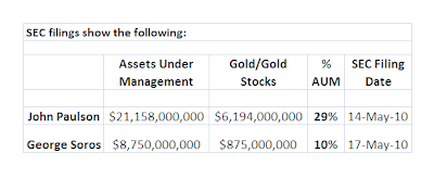
And finally, h/t to Tarlton Long, here is an example of some of the 'rubes' who are holding gold in their portfolio and its percentage of their Assets Under Management.


And finally Harvey Organ's June 2 Gold and Silver Commentary is worth reading.